

AI Integration Quick Reference
AI Integration Quick Reference
Styling Architecture
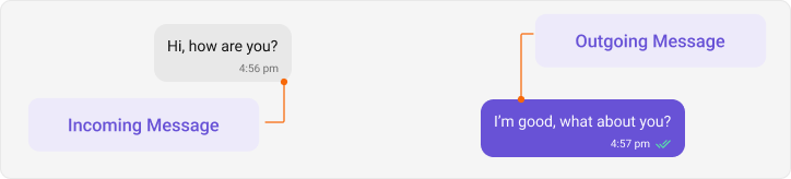
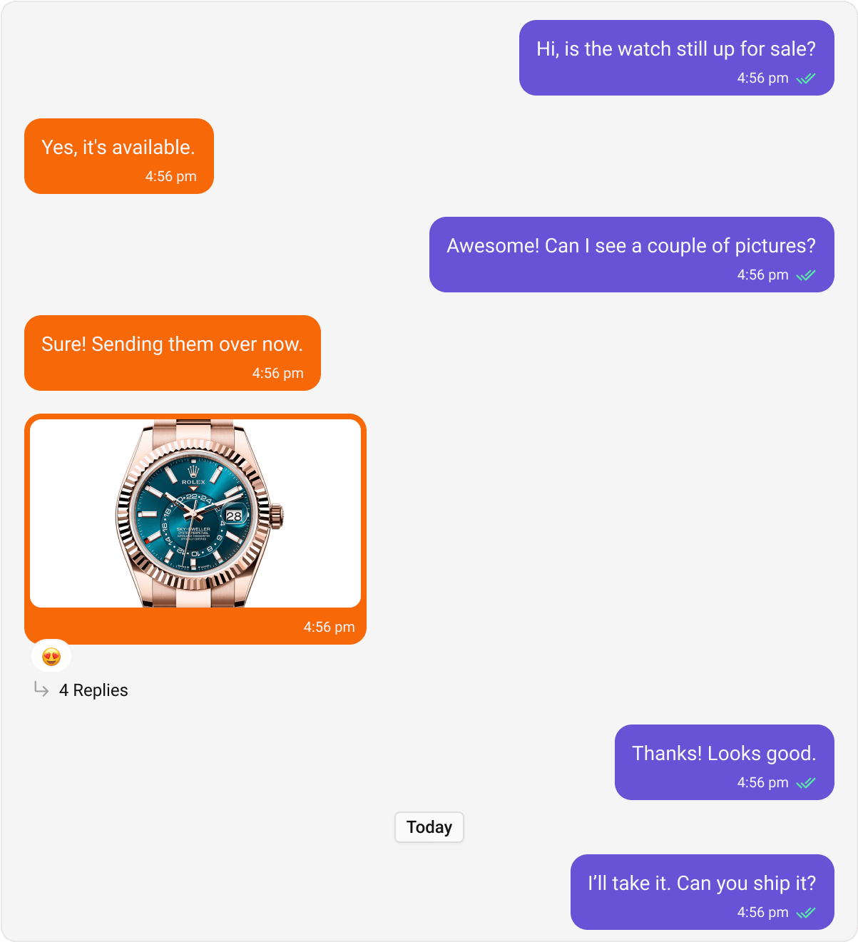
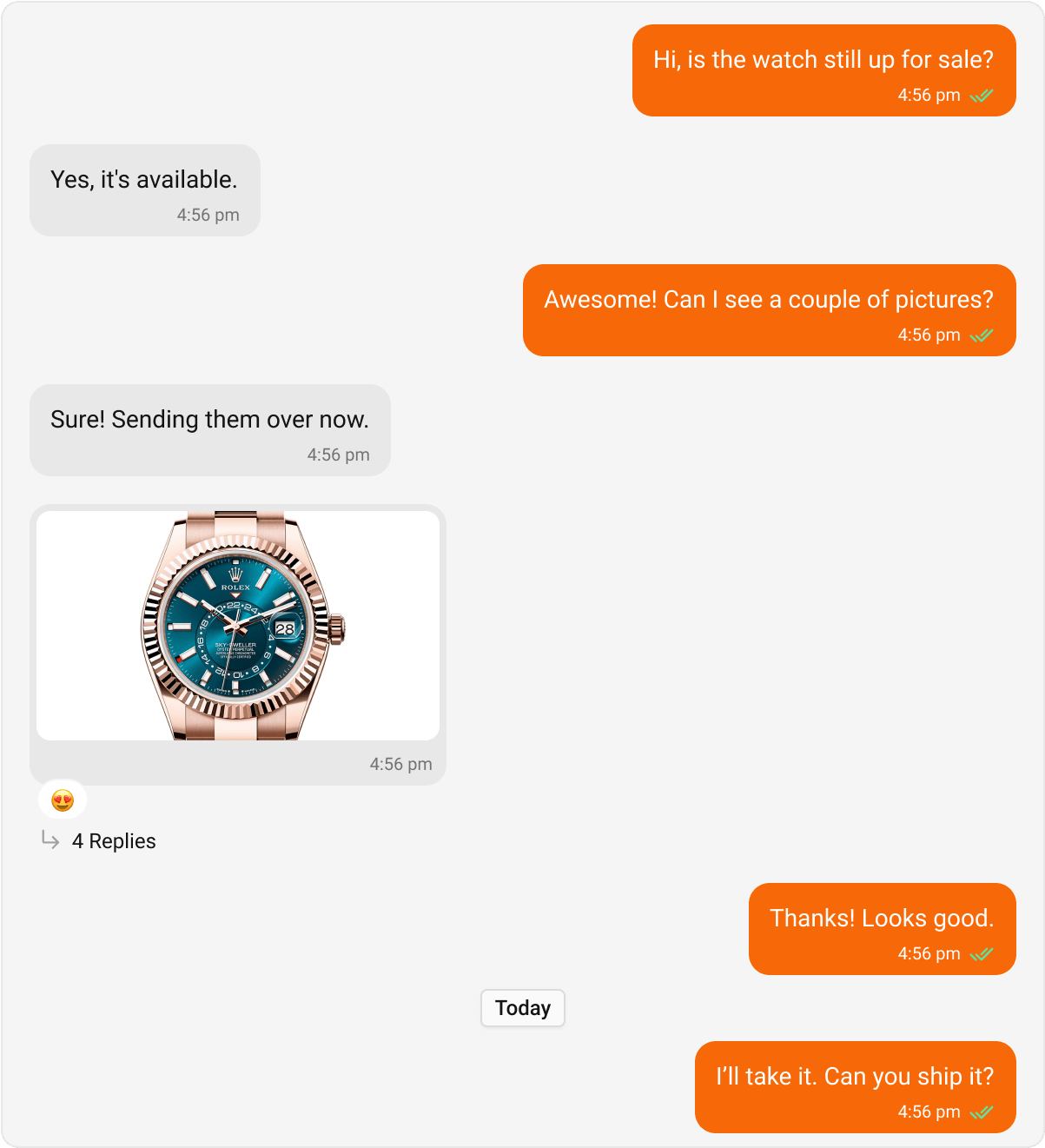
Message bubbles follow a hub-and-spoke pattern:- Hub styles —
IncomingMessageBubbleStyleandOutgoingMessageBubbleStylecontrol the base bubble appearance - Per-type styles — Text, Image, Audio, etc. are nested inside the hub styles
Global Setup
- Kotlin (XML Views)
- Jetpack Compose
themes.xml
Core Message Bubbles
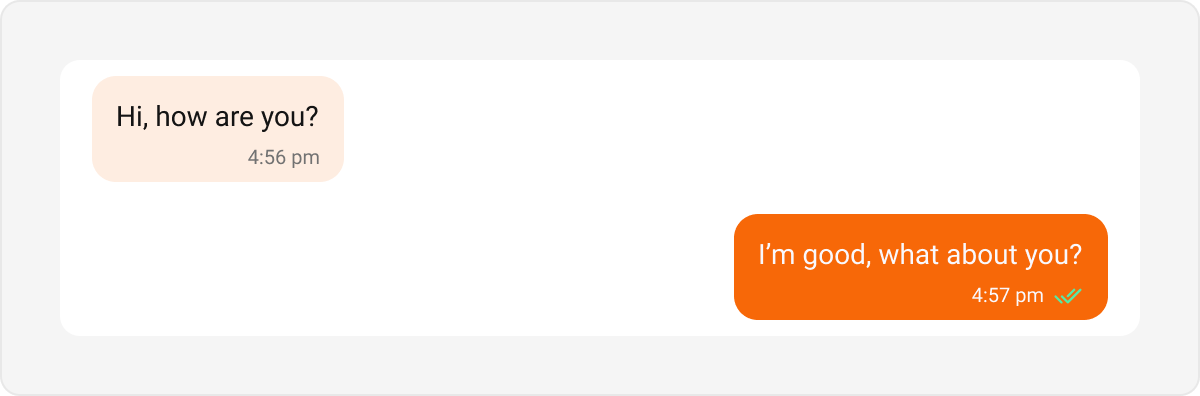
Text Bubble
- Kotlin (XML Views)
- Jetpack Compose
themes.xml
Image Bubble
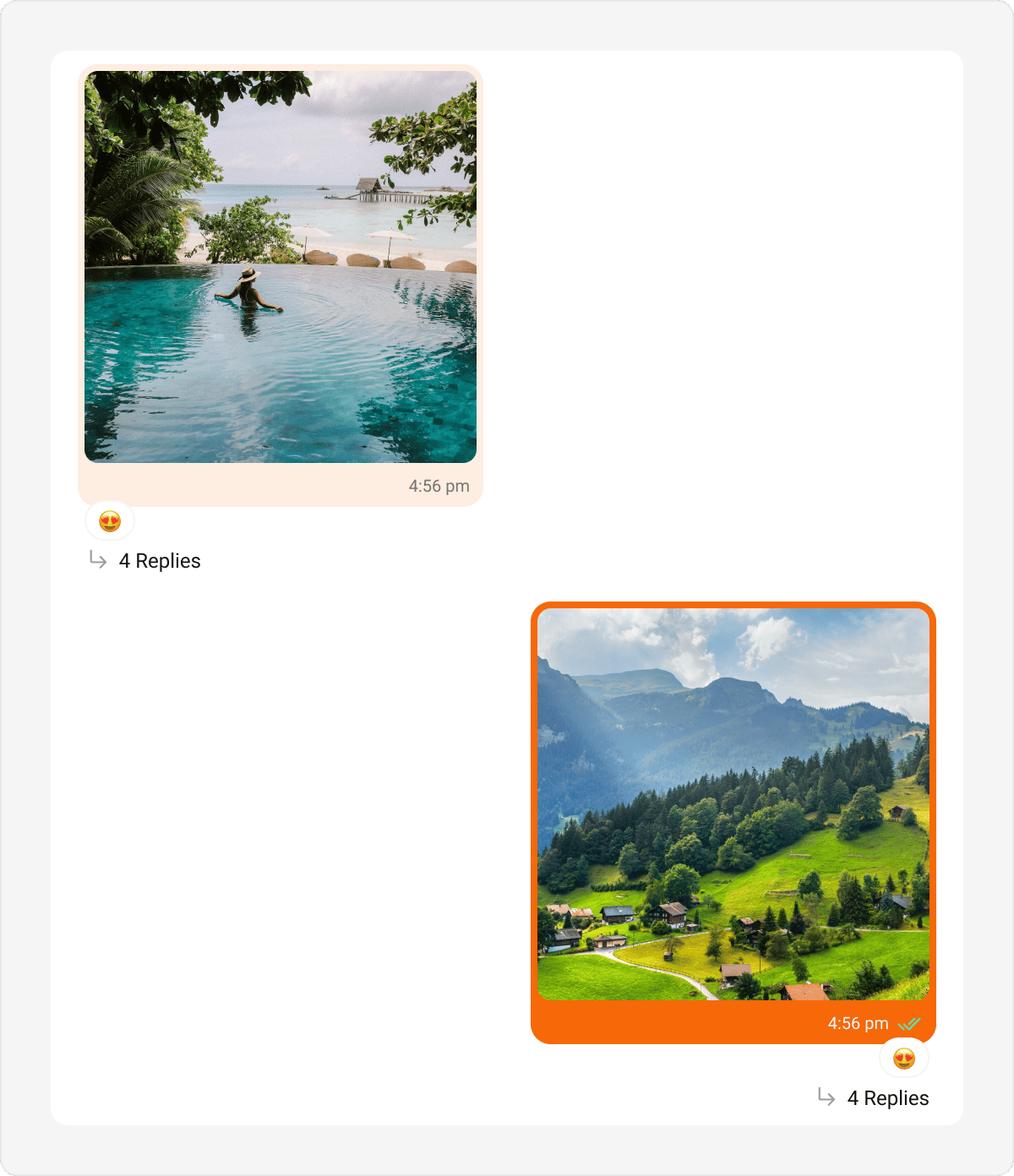
- Kotlin (XML Views)
- Jetpack Compose
themes.xml
Audio Bubble
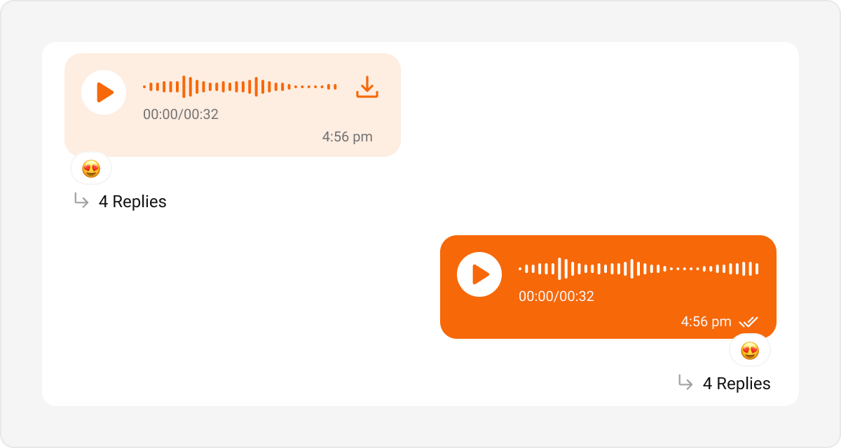
- Kotlin (XML Views)
- Jetpack Compose
themes.xml
Video Bubble
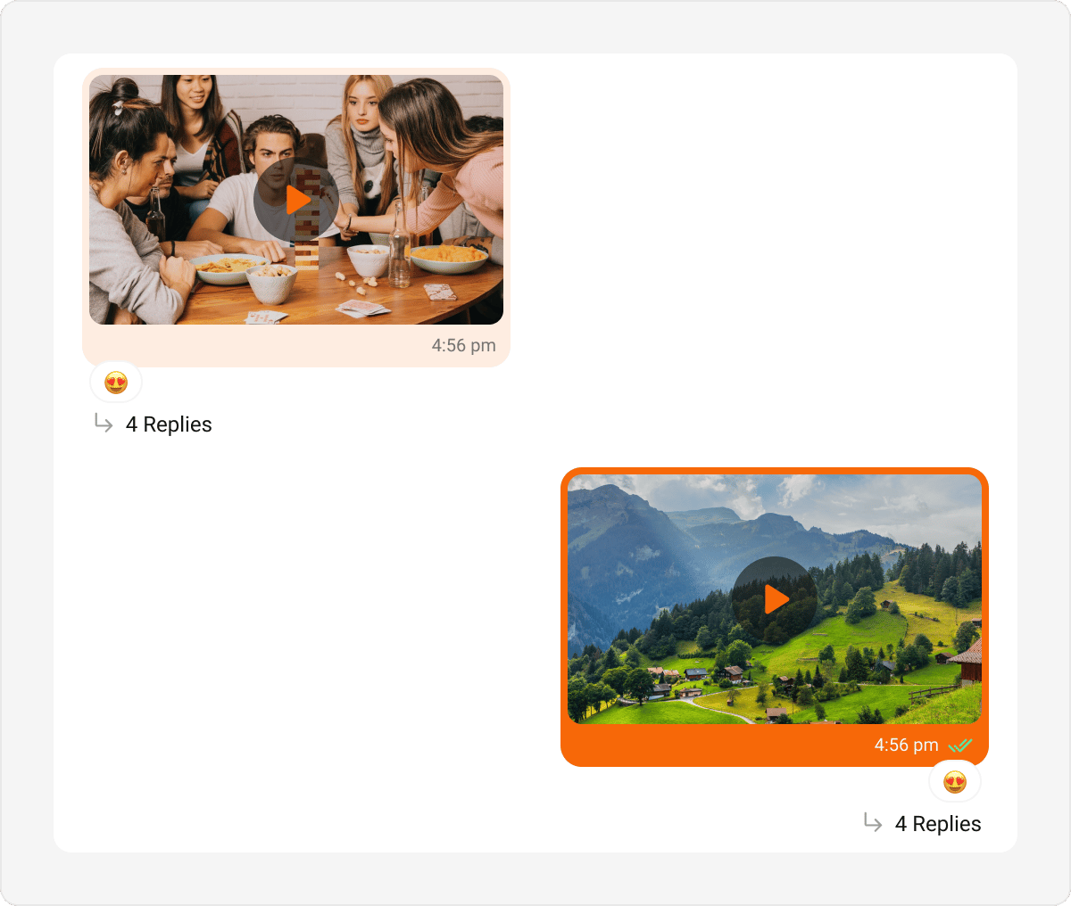
- Kotlin (XML Views)
- Jetpack Compose
themes.xml
File Bubble
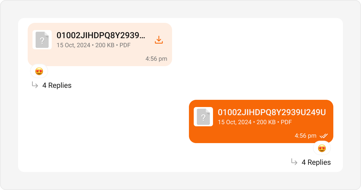
- Kotlin (XML Views)
- Jetpack Compose
themes.xml
Media Grid Bubble
Renders a message that carries multiple image or video attachments as a count-based grid (1, 2, 3, 4, or 5+ tiles). When there are more items than visible tiles, the last tile shows a “+N” overflow overlay; video tiles carry a centered play badge and a duration chip. Tapping a tile opens the fullscreen media viewer. A caption renders underneath the grid. The image grid and video grid derive their look from your CometChat theme. In Jetpack Compose they are governed by the dedicatedCometChatImagesBubbleStyle and CometChatVideosBubbleStyle classes. Their grid-specific properties:
- CometChatImagesBubbleStyle (Compose)
- CometChatVideosBubbleStyle (Compose)
Audio Files Bubble
Renders a message carrying audio file attachments (audio chosen through the file/audio picker) — one player row per file, each with a play/pause button, a seekable progress bar, the time, the file name, and a download control. Four or more files collapse behind a “Show N more” toggle. Only one row plays at a time.This bubble is distinct from the Audio Bubble, which renders voice notes recorded with the composer’s microphone. Voice notes keep their waveform look and are never grouped with other attachments.
CometChatAudiosBubbleStyle; the Kotlin (XML Views) list reuses your existing Audio Bubble style. Key Compose properties:
Files Bubble
Renders a message carrying document attachments as a connected stack of file cards — each with a file-type icon (PDF, Word, Excel, PowerPoint, ZIP, …), the file name, and its size/extension metadata. Four or more files collapse behind a “+N more” toggle. Tapping a card opens the file. A caption renders under the stack.cardBackgroundColor only applies when the message carries multiple files — a single file card sits directly on the bubble background.CometChatFilesBubbleStyle; the Kotlin (XML Views) list reuses your existing File Bubble style. Key Compose properties:
Captions containing rich text (code blocks, quote blocks, inline code) render through the same pipeline as Text Bubbles, so their formatting looks identical across message types.
Sticker Bubble
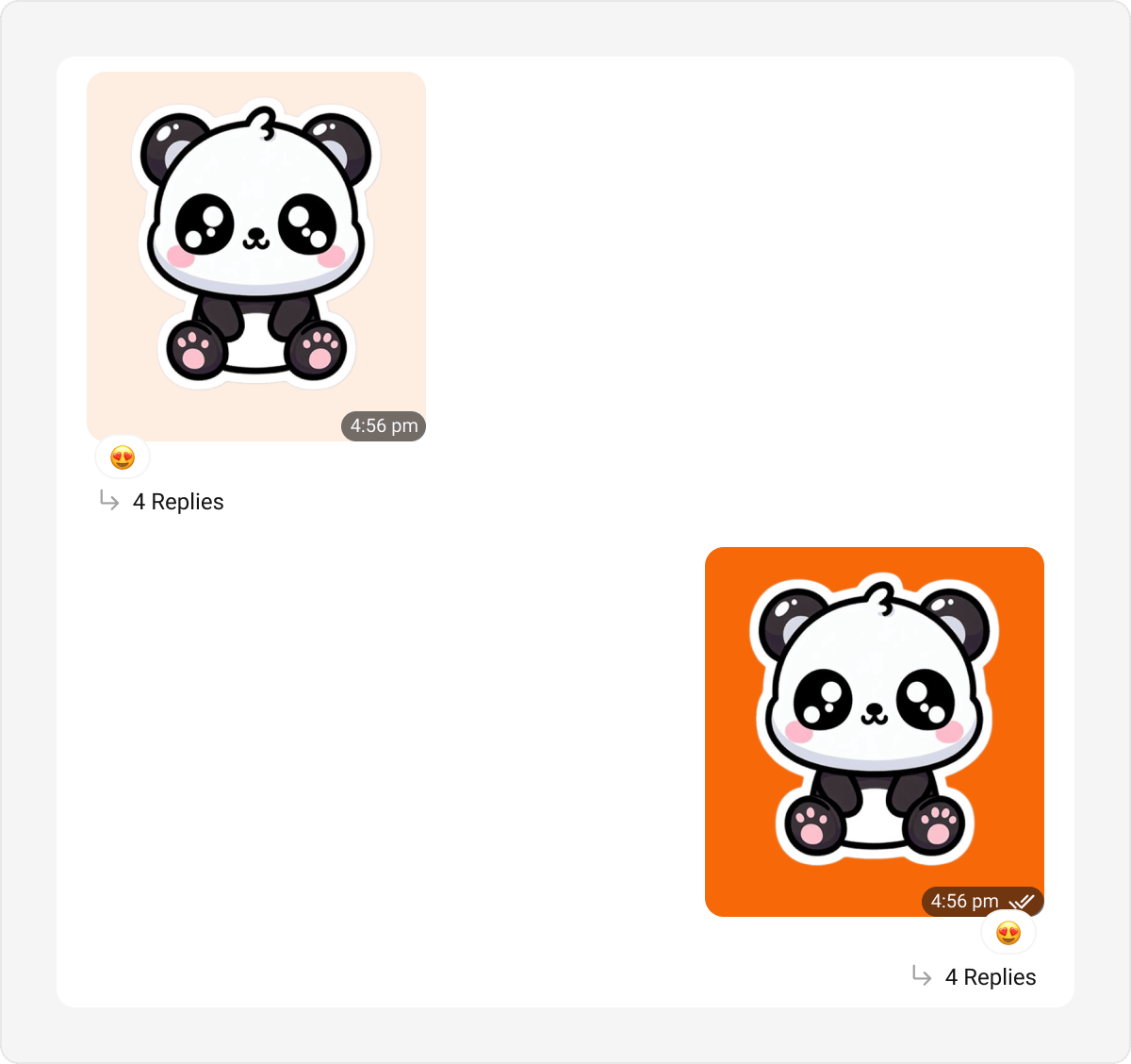
- Kotlin (XML Views)
- Jetpack Compose
themes.xml
Poll Bubble
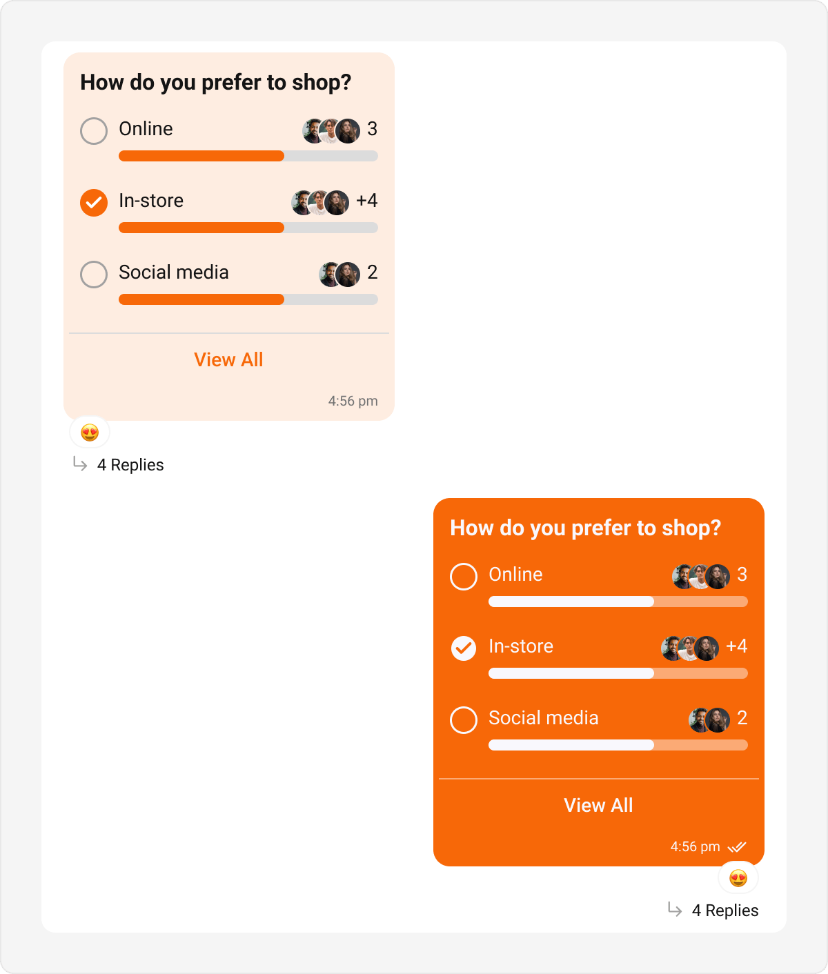
- Kotlin (XML Views)
- Jetpack Compose
themes.xml
Collaborative Bubble
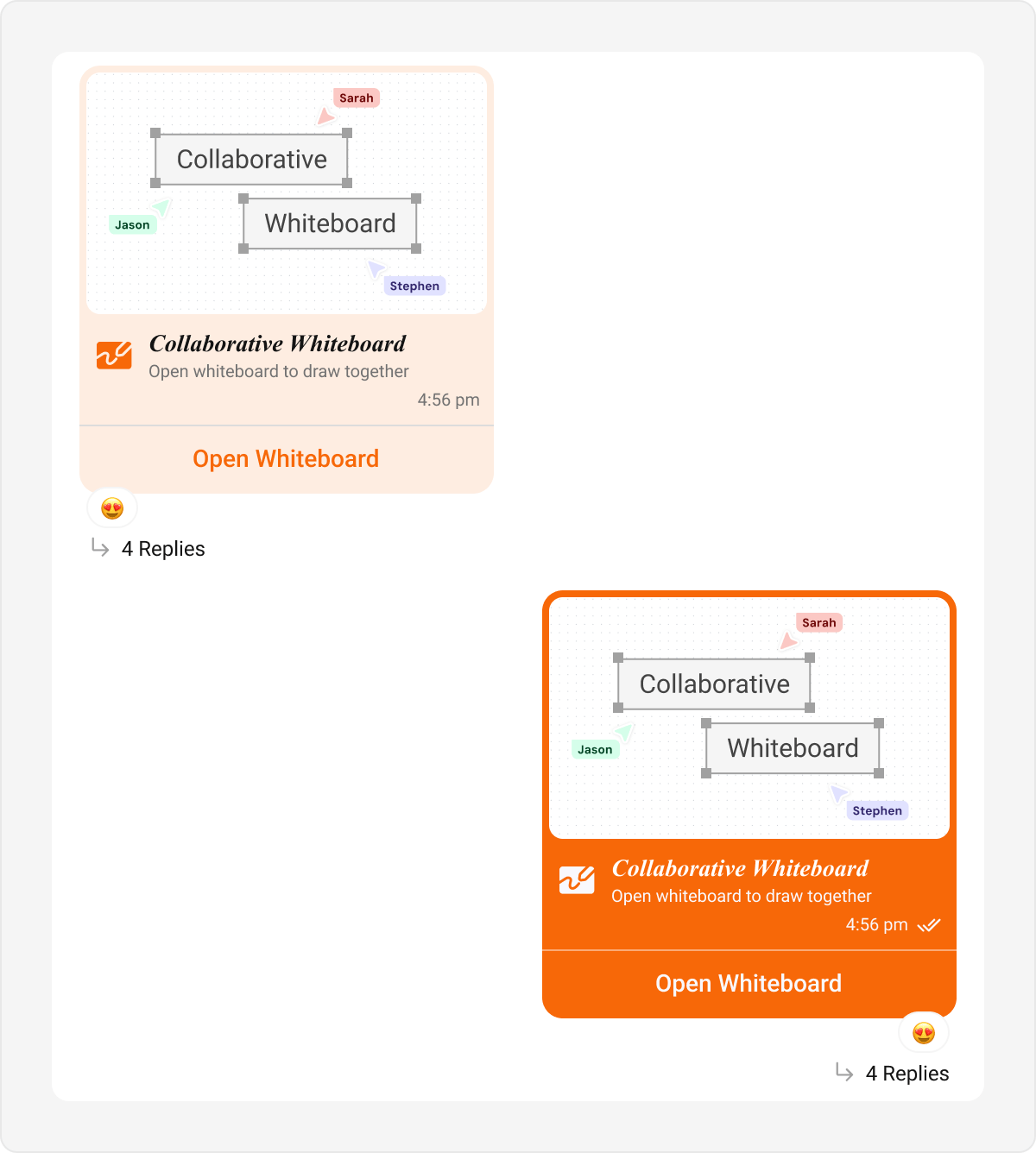
- Kotlin (XML Views)
- Jetpack Compose
themes.xml
Meet Call Bubble
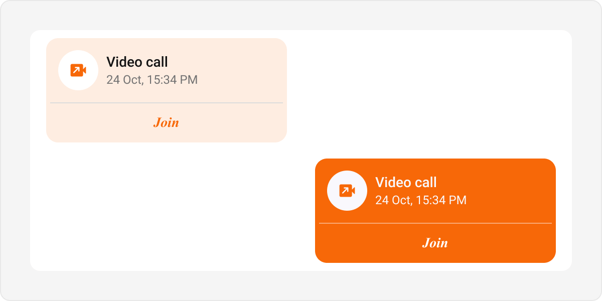
- Kotlin (XML Views)
- Jetpack Compose
themes.xml
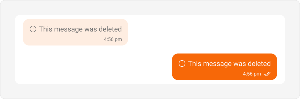
Delete Bubble
- Kotlin (XML Views)
- Jetpack Compose
themes.xml
List-Level Bubbles
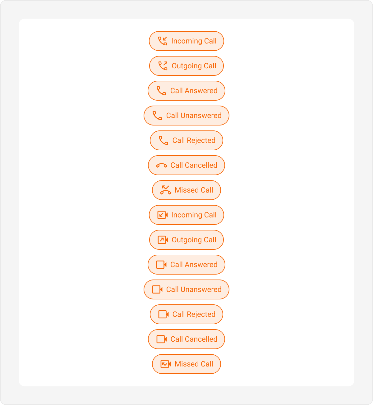
These bubbles are tied to the Message List style, not the Incoming/Outgoing hubs.Call Action Bubble
- Kotlin (XML Views)
- Jetpack Compose
themes.xml
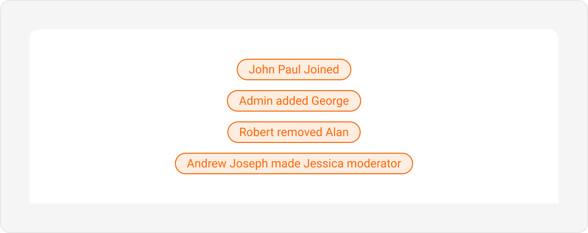
Action Bubble
- Kotlin (XML Views)
- Jetpack Compose
themes.xml